Danny
HYDROS Expert
Set the inputs to tile and then back to graph.
Follow along with the video below to see how to install our site as a web app on your home screen.
Note: This feature may not be available in some browsers.
Set the inputs to tile and then back to graph.
Yep, it is working after installing 178.This should be corrected with firmware 178. Can you verify that it is.
Long story short 178 is still not graphing for me.This should be corrected with firmware 178. Can you verify that it is.
What type of input is it that the graph is not working on?Long story short 178 is still not graphing for me.
All of them. I've got ato water level, ph, 2 temps, skimmer cup sensor. Power cycle and reading inputs gives no results still.What type of input is it that the graph is not working on?
Wow ok well I renamed my tank from Main Display to Waterville and now the graphing show up. Thats insane. Welp I guess longer storey it's fixed. But I had to change the name of my device. Which IS BARELY A FIX, the fact no one in testing had a single device in a collective not named Main tank or something with a four letter name is SHOCKING to me. Idk thanks I guess?All of them. I've got ato water level, ph, 2 temps, skimmer cup sensor. Power cycle and reading inputs gives no results still.
My control 4 device name was "Main Display" and my collection name is "180 Gallon".Was that the name of the collective or one of the Control units?
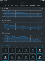
The range is automated and depends on the reading. The graph changes as the reading data is downloaded to the app when the app is started. As an example these are three 0-10v inputs and the scale on each graph is sized to the particular voltage range on the inputs.When the iOS app opens, there is an animation for the graphs that seems to zoom out from detail to the uselessly large range. Is it possible that someone mixed up a setting in the code for the app - would make sense if the animation went from wide view to the detail. Just a thought.

Is there a way to access the reading data? both to analyze in Python for fun and to take out the artificially high or low range values?The range is automated and depends on the reading. The graph changes as the reading data is downloaded to the app when the app is started. As an example these are three 0-10v inputs and the scale on each graph is sized to the particular voltage range on the inputs.
Not that I am aware of at this time. I think someone has suggested a way to export the data already.i think it may be on their list.Is there a way to access the reading data? both to analyze in Python for fun and to take out the artificially high or low range values?
